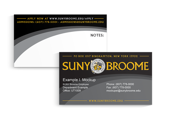
All publications intended to represent any aspect of SUNY Broome Community College created by individual departments or professionals must adhere to the Primary Logo Style Guide as well as guidelines below.
Before any publication intended for public view is mass produced, a sample should be emailed to the Office of Marketing and Communications for approval at marcom@sunybroome.edu.
Fonts
Major titles and headings for publications should be in the font Albertus Titling. Subheadings and body text may be in any of the following fonts depending on audience; however, it is recommended that only one of these be used in addition to Albertus:
- Chaparral Pro
- Arial Regular
- Lato
For more information, see Typography
Colors
The primary, dominant color in all print design should be black with the SUNY Broome yellow or blue used sparingly. The SUNY Broome red and gray may be used as a tertiary colors; however, these should be used sparingly as well. For exact colors, please see Color Themes.
Design
Below are examples of appropriately designed SUNY Broome materials. For various design templates, please see Publication Templates.

